Levi is going all out to do their bit for the environment and have created a brilliant ad campaign in the process. With the help of Lucas Barras, an award winning creative known for his animation and illustration, this collage styled advert is a great success and strongly puts their point across. The adverts hand crafted style adds to its appeal. Lets hope their campaign works and they set an example for others in their field to follow.
Thursday, 24 February 2011
Wednesday, 9 February 2011
T-Post
Our intern Adam, told us about T-Post - a wonderful combination of t-shirt and magazine. The difference is that an issue is a T-shirt, with an article printed on the inside and an illustration on the front. Subscribers receive a new 'issue' every six weeks, but they have no idea what they are going to get until the issue drops through the post box. We think its a great idea. Find out more here and watch the video here
Saturday, 5 February 2011
Exhibitions: Orozco at Tate Modern
A recent visit to Orozoco at the Tate Modern made for an enjoyable Sunday afternoon. One of my favourite pieces was a vintage Citreon, which had been chopped into thirds length ways and reassambled with the middle third removed - creating an intriguing and fun (but unfortunately not functional) new form. Other highlights included a bicycle assemblage and a found-tyre installation created by Orozoco in response to the space at Tate Modern. I'm no art critic, we'll leave that to Brian Sewell, I'll just say its light hearted, visually interesting, interactive and well worth a visit. Visit the Tate website here to find out more.
Thursday, 3 February 2011
Starbucks Logo change
Not being a coffee drinker myself, I might be behind on the news but I was surprised to recently discover that the Starbucks logo has recently undergone a makeover. Its surely one of the most recognisable and ditinctive logosin our moern everyday lives. The new logo isn't a drastic move away from the old one, I can't envisage a Gap style disaster, it is effectively a simplification - keeping the same green colour and iconography, but dropping the text and moving from 2 colour to one colour. Read more here and here
Thursday, 20 January 2011
Olympic Logo 2016
 The Olympic logo was unveiled on New Year Eve 2010. Created by Tatil, based in Rio de Janeiro. The link gives you an idea of the designers thoughts and ideas that went into creating this logo http://vimeo.com/18331485
The designers have even taken a Rio landmark, Pão de Açúcar or Sugar loaf Mountain, and mapped the logo in. It also interestingly spells out ‘Rio‘ too...
Monday, 13 December 2010
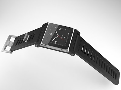
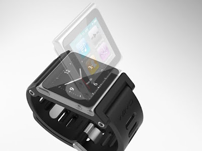
TikTok & LunaTik Multi-Touch Watch Kits
This creation has been developed by TikTok and LunaTik which simply transforms the iPod Nano into the world's coolest multi-touch watches.
TikTok is a simple snap-in design. It allows the user to easily and securely snap the Nano into the wrist dock. It cleanly and simply integrates the Nano and transforms it into a modern multifunction timepiece.


LunaTik is designed and intended to be a premium conversion kit for someone that wants to dedicate their Nano to being a watch and the newest conversation piece with their friends. It is forged from Aerospace Grade Aluminum.
Friday, 10 December 2010
How Colours Affect Purchases

Pantone released there colour of the year for 2011 as Honeysuckle "a dynamic reddish pink." The colour described by Pantone is Courageous, Confident & Vital. A brave new colour, for a brave new world. Let the bold spirit of Honeysuckle infuse you, lift you and carry you through the year. It’s a colour for every day – with nothing “everyday” about it.
This leads to the question of how colours affect purchases?

An infographic designed by online analytics firm KISSmetrics details the impact colour has on purchasing decisions.
KISSmetrics found that each 93% of all consumers place visual appearance and colour above other factors, and that 85% of them place colour as the “primary reason” for why they buy a particular product.
Buyers are also swayed by individual colours. Where red could mean “energy” and “creates urgency”, purple is used to “soothe and calm”, the infographic states.
And for brands looking to home in on the impulse shoppers, KISSmetrics said red, orange, black and blue are the colours that appeal to that demographic.
Subscribe to:
Posts (Atom)


